US Political Parties and the Economy
Tagged:MathInTheNews
/
Politics
/
Statistics
Does it matter, economically speaking, which US party holds the Presidency, Senate, and House? Maybe not the way you think! The last 50 years of evidence implies Republicans are associated with worse inflation and unemployment. It is false that Republicans are better on the economy. That myth needs to die.
Conventional Wisdom
Conventional wisdom in the US is that Democrats are always better on social issues, but Republicans are always better on the economy & defense. I actually don’t quite know the basis for this. It’s probably just assuming that Republicans are either rich or in deep with big corporations, and thus should know a thing or two about making money.
However, as I vaguely recall economics Nobelist Paul Krugman saying, making money is one thing but managing an economy is quite another!
Mostly my memory of Republican rule since Reagan has been that they cut taxes only for the wealthy (which never “trickles down”), expand the military, start wars, restrict civil rights, and generally blow up the deficit and the national debt. If that memory is accurate – note the big “if” – then all of that can’t be good for the economy and the data should say so.
So let’s go find some data and see if we can interrogate it properly.
NB: This is really a job for professional economists. The datasets are either so small, or so corrupted by artifacts, or otherwise difficult to interpret that an amateur like me has little chance compared to the much better data presumably available to professionals.
(Are we going to let that stop us? Of course not! We expect to fail, but informatively. In the words of the absurdist playwright Samuel Becket, “I try. I fail. I try again. I fail better.”)
(TL;DR: The conclusion is stated briefly at the end.)
The Available Data
Political Predictor Data
We’re going to look at the partisan control of the US Presidency, House, and Senate from 1977 to today.
- If we attempt to get back before 1977, then we’re into Nixon, Watergate, and an era when
the US political parties were rather different animals than they are now.
- Arguably, we’re already going too far back because the election of Reagan in 1980 was when the hard right-wing absurdities began to surface in the Republican party!
- Mostly it’s straightforward to annotate each year, which we will consolidate to 2-year
congressional terms.
- One subtlety is the year 2000: the Senate was 50-50, so the Lesser Bush administration would have had VP Cheney breaking ties. However, Sen Jim Jeffords switched parties to the Democrats, granting the Democrats a narrow margin of control in the Senate. Since the Republicans ran the Senate for only a short time, we coded this term as a D Senate.
Our source for the Congressional party breakdowns was Wikipedia [1], which records all this in a form useful to paste into our spreadsheet. The presidents we just did from memory.
Economic Outcome Data
Acquiring and curating the economic data was a bit more subtle, from deciding what we want in the first place, to where to acquire high-quality data over our time period, and how to assess that data.
We decided we wanted to cover issues that seem relevant to political choices by voters, and at least slightly amenable to policy choices by politicians. Now, let’s be fair: I didn’t do an objective feature selection process over an economic database of lots of measures; instead these are chosen because they matter to voters and politicians only in my personal estimation. I could be wrong! (Gentle corrections, as always, solicited.)
So in the end I chose several measures of inflation, unemployment, growth, and investment returns:
-
Inflation: There are literally dozens of measures available here, possibly more. The US Bureau of Labor Statistics and the US Federal Reserve Bank provide several, and there are private sector alternatives such as the MIT Billion Prices Project.
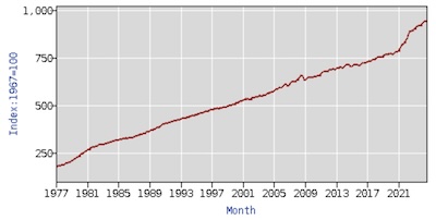 In the end I chose the BLS’s Consumer Price Index for all urban consumers
(CPI-U). [2] Despite the screams of outrage from
Republicans in rural red states, most of us live in cities, suburbs, and towns. So this
is the series most likely to reflect voters’ experience of inflation.
In the end I chose the BLS’s Consumer Price Index for all urban consumers
(CPI-U). [2] Despite the screams of outrage from
Republicans in rural red states, most of us live in cities, suburbs, and towns. So this
is the series most likely to reflect voters’ experience of inflation.We had the BLS web site use give us the annual percent change (i.e., inflation for that year) computed from the version of the CPI-U time series normalized to be 100 in 1967 (series CUUR0000AA0). Because it is an annual series, it is not seasonally adjusted. We got complete data for all years 1977 - 2023 (of course the complete data for this year, 2024, is not available yet).
-
Unemployment: There are a lot of measures of unemployment! This is a fraction, with people looking for work in the numerator and total people available for work in the denominator. There is a lot of nuance in choices surrounding who counts for both of those sets. Men/women, prime working age 18-54, geographical regions, etc.
Most interestingly, the usually-reported measure of unemployment (called U3) does not include “discouraged workers”. To me this always smacks of human sacrifice: why do those people “not count”?
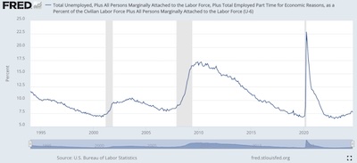
- However, there’s a broader measure that does include “discouraged”
workers, the long-term unemployed, those partially employed for economic reasons, and so
on. This is U6, and it’s what we use. [3] It tends to be
a lot higher than U3, unsurprisingly, and hence makes things look worse. Of course,
they actually are worse, and pretending some people “don’t count” is a cruel form of
deception. However, they do tend to move in tandem at high correlation, again
unsurprisingly.
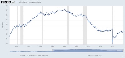
- Another measure of employment – note it’s the reverse of un-employment –
is the Labor Force Participation Rate. [4] There are a lot
of versions of this too, but the simplest is just the ratio of people being paid for
work (generally accessible from tax receipts plus some extrapolation for
self-employment), divided by the population (or the population of working age, or…).
The series we picked is called CIVPART, or the “civilian participation ratio”.
So there are variations, but it seems to be a pretty honest way of asking what fraction
of the population is working.
- However, there’s a broader measure that does include “discouraged”
workers, the long-term unemployed, those partially employed for economic reasons, and so
on. This is U6, and it’s what we use. [3] It tends to be
a lot higher than U3, unsurprisingly, and hence makes things look worse. Of course,
they actually are worse, and pretending some people “don’t count” is a cruel form of
deception. However, they do tend to move in tandem at high correlation, again
unsurprisingly.
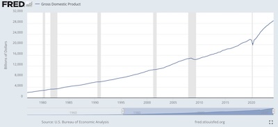
- Economic Growth: The absolutely standard measure of the size of the economy, like it or not, is the Gross Domestic Product. [5] We use that here, with some reservations about whether it should be corrected for inflation since the start date of our data in 1977.
-
Investment Returns: Rather than just use some stock index or other, we wanted a measure that was (a) actually investable by people of ordinary means, i.e., a mutual fund or ETF, and (b) included reinvestment of dividends and capital gains, and was corrected for inflation. So many times people report just the Dow Jones Industrial Average (itself a pretty nonsensical index), and forget about reinvestment and inflation.
So we used 2 different measures, each a retail index fund from Vanguard. They tend to be replaced by other “Admiral” versions nowadays, but they have a long tail into history that’s useful for our purposes.
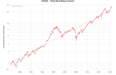
- VFINX is the S&P500 index fund. [6] It’s sort of what
people think when they think “index fund”, though really there are index funds in all
sorts of other markets. It represents the large-capitalization, neutral valuation
section of the American stock market. It’s not the complete US market, let alone
the world market, but it’s still a pretty ok measure of US investment returns.
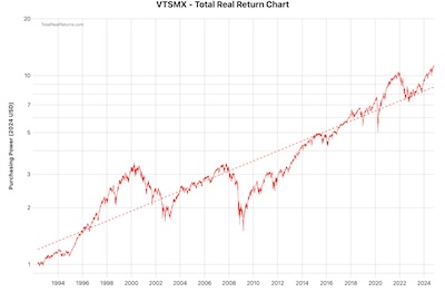
- VTSMX is the US Total Stock Market index fund. [7] This includes the S&P500, but also (via sampling) the mid- and small-cap sectors. Over time, it has tracked various indices: the Wilshire 5000, the Dow Jones Total US Market (after DJ bought Wilshire Associates?), and now the Center for Research in Security Prices (CRSP) index from the University of Chicago. Those all track pretty much the same thing, and are mostly about Vanguard’s pursuit of the cheapest provider whose index they can license, not about changing the definition of the market.
We’ve adjusted both the VFINX and VTSMX time series to include reinvestment of distributions and to correct for inflation. So they’re total real returns. (We could have done the inflation adjustment ourselves with the Fisher equation for real returns, but opted to let the data provider do that instead.
- VFINX is the S&P500 index fund. [6] It’s sort of what
people think when they think “index fund”, though really there are index funds in all
sorts of other markets. It represents the large-capitalization, neutral valuation
section of the American stock market. It’s not the complete US market, let alone
the world market, but it’s still a pretty ok measure of US investment returns.
The Joint Dataset
 We assembled all that into a single dataset [8], a subset of
which is shown here. For each year, we record the partisan control status of each of the
3 branches of the US federal government, and the various economic variables for that
year.
Consolidation to 2-Year Congressional Terms
However, that’s not quite what we want: partisan control can only change at the fastest turnover rate of a branch of the government, which in this case is every 2 years for a House congressional term. So we want to consolidate the data by congressional term.
“Consolidate” can have a subtle meaning. Fortunately, the political variables are constant across a congressional term (modulo the episode with Jeffords to which we alluded above), so combining them is easy. But combining the economic variables to obtain a value for 2 years, but annualized, can require a bit of care. Here’s what we did:
-
Inflation is a rate of a single quantity that compounds over years. So we compounded it over 2 years and took the geometric mean to annualize the result.
If we have 2 interest/inflation rates I1 and I2 expressed as decimals between 0 and 1, then the annualized compound rate would be I given by:
(1+I)2=(1+I1)(1+I2)But if somebody’s gone and scaled them by 100 to express them as percentages for normal people, i=100I, then we have to fiddle about a bit de-scaling and re-scaling by 100:
i=100×(√(1+i1/100)(1+i2/100)−1) - U6 and LFPR don’t compound, so we averaged them over the 2 years of the congressional term.
- For GDP, we computed a growth rate for each year over the previous. We then compounded those 2 growth rates (as above, with inflation) to produce a 2-year compounded, annualized GDP growth rate for the congressional term.
- VFINX and VTSMX were also compounded in the same way. (In a previous iteration on these data, we had nominal rather than real returns. In that case, we also used the Fisher equation to get real returns after inflation, which were then compounded. That extra step is not necessary here since we started with real returns after inflation.)
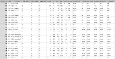 The resulting consolidated dataset for congressional terms [9]
is shown here in its entirety, because that emphasizes the point that the available data
is quite limited. Note that there are only 24 congressional terms in our time window, and:
- The 2023-2024 term is useless for us, as we do not have year-end economic data for 2024.
- U6 is available only for 14 terms.
- VTSMX is only available for 15 terms.
- VFINX is only available for 22 terms.
So we’re teetering on the edge of being data-starved here, and hence can ask only the crudest of questions and hope for big signals to show up in the small dataset.
That being the case, we must abandon any idea of predicting a continuous variable, like unemployment or inflation. Instead, we’ll binarize all the economic variables into a 2-level factor with levels “Better” and “Worse”. (These are the “Indic” variables seen above in the right of the spreadsheet, i.e., indicator variables.)
- For inflation, “Better” is if inflation is below the Fed’s target inflation rate of 3%, “Worse” is if it’s above.
- For U6 unemployment, “Better” is if it went down compared to the previous congressional term, and “Worse” is if it went up.
- For the Labor Force Participation Rate, it’s the opposite compared to U6: “Better” if it goes up, “Worse” if it goes down.
- For GDP, we code “Better” if the rate of increase is above the mean over this dataset, and “Worse” if it is below that mean.
- For VFINX and VTSMX, similarly to GDP, we code them as “Better” if their returns are above the mean in this dataset, and “Worse” if below.
So basically we’re going to see if the political situation – who’s in control of the Presidency, the House, and the Senate – has any bearing on whether economic variables get “Better” or “Worse”. We explicitly do not attempt to predict by how much, since we have so few data points to predict anything at all. Better to predict a single bit of an indicator variable than to fail miserably at predicting a continuous dependent variable!
An Exploratory Look
First, let’s look at some crosstabulations of the political variables. A large p-value from a χ2 test will indicate that the variables are somewhat independent, which is good for our use of them as predictors.
Party of the President (rows) vs the party of the House (columns), χ2 test p∼41%:
        D  R | Totals
D       5  7 |    12
R       8  4 |    12
-------------|------
Totals 13 11 |    24
Party of the President (rows) vs the party of the Senate (columns), χ2 test p∼41%:
        D  R | Totals
D       8  4 |     12
R       5  7 |     12
-------------|-------
Totals 13 11 |     24
Party of the House (rows) vs party of the Senate (columns), χ2 test p∼23%:
        D  R | Totals
D       9  4 |     13
R       4  7 |     11
-------------|-------
Totals 13 11 |     24
We see that control of the presidency is evenly divided at 12 terms each, and both the House and the Senate are pretty evenly divided at 13 and 11 terms each. Also, in each case, there are plenty of off-diagonal entries in the table to let us interrogate the divided government situation.
With respect to the economic variables, we note that they are all continuous variables (not the indicators). So we’ll compute the Pearson correlation and then bicluster it to see what’s going on in terms of correlation and independence. (NB: We used pairwise complete observations here, and not all the time series are the same length. That gets us the maximum of correlation information, but sometimes a few identities you’d think would hold do not, in fact, hold. That’s because potentially each correlation is computed over the intersection of 2 time series that might be over different years.)
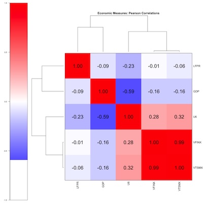 The biclustered correlations indicate:
- VFINX and VTSMX are basically the same thing (lower right corner). All my angst about including small-caps as a “realistic” investment vehicle are unlikely to matter.
-
Oddly, U6 has a mild positive correlation with the stock market variables VFINX and VTSMX. I’d have thought higher unemployment would happen in recessions, when stock returns went low or negative.
Warren Buffet is supposed to have said “Bear markets are where you make all your money, you just don’t know it at the time.” I think he was talking about cost-averaging, i.e., your regular investments buy more shares in bear markets because the prices are lower, and in the long run that benefits you. Maybe not what’s happening here, though it came to mind.
Probably what’s happening here is the mild positive correlation is not statistically significant, given the paucity of our data.
- U6 and GDP are rather anti-correlated, as you’d expect in a recession GDP goes down and unemployment goes up.
- U6 and LFPR are not as negatively correlated as I’d expected. Probably what’s going on here is that the LFPR is rising for demographic reasons, related to women entering the workforce over time, and later the Boomers leaving it. Those demographic facts are independent of the economy, and would reduce the correlation. (They would also reduce the utility of LFPR in this analysis.)
Some Predictive Models
The R script for this whole analysis is also available, along with the usual transcript of running it. [10]
We performed 2 kinds of regressions. First, we did logistic regression of whether each economic variable got Worse or Better based on the partisanship of the federal government with a pretty simple 4-parameter model:
logPr(Worse)Pr(Better)=β1PartyPresident+β2PartyHouse+β3PartySenate+αHere, the R regression software
glm() took the D
level of each variable as the base, and the R level as the contrast with respect to that
baseline. (This is why I went to some effort to ensure that all the factors code their
levels the same way!)
Meaning: The model will tell us (effectively) how much an R level in one of the government branches increases the probability that a given economic variable has a “Worse” outcome.
We also attempted to consider a model with interactions, i.e., where there is an additional effect if both parts of Congress are a single party, or the President and the Senate, or any other pairwise interaction, as well as the trifecta case, for an 8-parameter model:
logPr(Worse)Pr(Better)=β1PartyPresident+β2PartyHouse+β3PartySenate+β4PartyPresHouse+β5PartyPresSenate+β6PartyHouseSenate+β7PartyPresHouseSenate+αThis is, frankly, likely to be a bit of hubris on my part. Nobody should be estimating an 8-parameter regression model on just 14-24 data points!
The right thing to do, for some value of “right”, would be to use
glmnet(), let it
do feature selection to choose variables (and interactions) and regularization of model
complexity with LASSO and crossvalidation, and let it do crossvalidation to choose the
model complexity. There are 2 problems that stand between us and doing The Right Thing:
glmnet()is at best awkward with predictors that are categorical variables. Apparently one has to mess withmodel.matrix()and do manual dummy-coding. I wrestled with it for a few hours and grew frustrated. Something I should learn eventually, perhaps.- We absolutely do not have enough data for crossvalidation. This means that LASSO regulation can’t really happen, since the value of the L1 penalty factor λ is determined by crossvalidation.
So we’re left with doing a couple forms of regression, measuring significance and strength somehow, and just recognizing that we’ll almost certainly over-train.
-
We’ll assess the statistical significance of the fits with the Akaike Information Criterion (AIC). This is a penalized log-likelihood measure, in which models with more parameters are penalized and thus have to achieve better log likelihoods. The preferred model has the smaller AIC. This will permit us to compare the 4- and 8-parameter models above on an even basis. It is also as close as we can come to fighting over-fitting, without enough data to power LASSO.
It will not, however, tell us a significance cutoff threshold. That’s ok, we’re not crossvalidating due to lack of data anyway.
-
To assess the strength of the model, we’ll run each regression model on its own training data (A cardinal sin! Or at least an ordinal sin?). That will give us a probability of “Worse” for each congressional term. We’ll sort by that probability, and then do a Mann-Whitney rank test to see if the Worse/Better outcomes are statistically significantly sorted.
That is to say, a significant Mann-Whitney p-value will mean at least we can predict well on our own training set. If we can’t even do that, the model is nonsense. If we can, it might mean something, but we don’t have the data to crossvalidate.
Perhaps an example will make this clear. Consider the 4-parameter model for predicting a better or worse U6 (which the best model by the AIC criterion). The regression coefficients individually aren’t awe-inspiring, as none of them are individually statistically significant:
Coefficients:
                  Estimate Std. Error z value Pr(>|z|)
(Intercept)      3.000e-15  1.414e+00   0.000    1.000
PartyPresidentR  4.021e+01  1.411e+04   0.003    0.998
PartyHouseR     -2.070e+01  9.501e+03  -0.002    0.998
PartySenateR    -2.020e+01  1.043e+04  -0.002    0.998

(Dispersion parameter for binomial family taken to be 1)

    Null deviance: 17.3232  on 12  degrees of freedom
Residual deviance:  6.5917  on  9  degrees of freedom
AIC: 14.592
However, the AIC of 14.6 is the smallest one found in this study.
When we run the fitted model on the training data (!) it assigns a probability of Worse to each congressional term like this:
       Years PartyPresident PartyHouse PartySenate DepVar         pHat
11 1997-1998              D          R           R Better 2.220446e-16
12 1999-2000              D          R           R Better 2.220446e-16
20 2015-2016              D          R           R Better 2.220446e-16
18 2011-2012              D          R           D Better 1.018808e-09
19 2013-2014              D          R           D Better 1.018808e-09
14 2003-2004              R          R           R  Worse 3.333333e-01
15 2005-2006              R          R           R Better 3.333333e-01
21 2017-2018              R          R           R Better 3.333333e-01
17 2009-2010              D          D           D  Worse 5.000000e-01
23 2021-2022              D          D           D Better 5.000000e-01
13 2001-2002              R          R           D  Worse 1.000000e+00
22 2019-2020              R          D           R  Worse 1.000000e+00
16 2007-2008              R          D           D  Worse 1.000000e+00
Note that the “Better” out comes are enriched at the top of the list with tiny
probabilities for being “Worse”. Then there’s a steep jump up in that probability, and
the “Worse” examples start appearing. Indeed, the Mann-Whitney rank statistic here has
p∼0.0116, which is quite good. Low values of pHat near 0 predict better,
middling values are mixed, and large values near 1 predict worse.
If you look through the transcript, you’ll see that the regressions were either non-predictive, or if predictive had no coefficients that were individually statistically significant, but together predicted somewhat well. (Notable exception: when predicting InflationIndic in the 4-parameter model, PartyHouseR was just significant with p∼4%.)
So it takes all the predictors acting together to make a prediction, it’s not just when 1 branch falls to Republicans that things go bad. You have to take into account the whole picture.
Here’s the summary table showing the AIC and prediction p-value for all the economic variables, in the 4-parameter and 8-parameter models:
        DepVar |  AIC-4   p-4 |  AIC-8   p-8
--------------------------------------------
InflationIndic |  27.79 0.003 |  30.09 0.001
       U6Indic |  14.59 0.012 |  20.59 0.011
     LFPRIndic |  33.69 0.057 |  37.91 0.057
      GDPIndic |  34.22 0.102 |  37.91 0.057
    VFINXIndic |  35.75 0.333 |  40.68 0.240
    VTSMXIndic |  26.70 0.337 |  29.96 0.150
Note in the comparison between the simple 4-parameter model and the more complex 8-parameter model:
- When the prediction p-value is significant, it’s comparable.
- But in every case the smaller AIC is always with the 4-parameter model.
This indicates that the 8-parameter model, while it pretends to have slightly better prediction p-values, is almost certainly achieving that by over-fitting. (If only we had enough data to LASSO and crossvalidate, so we could tell!)
So we conclude that the 4-parameter model makes acceptably good predictions of the Better/Worse trend in Inflation, U6, and not much else. (Labor Force Participation Rate is on the edge, but as we remarked above it may be more driven by demographics than politics and policies.)
The Peer Review Corner, Self-Critique Version
Look, we tried really hard here. We’re tired of listening to people argue about politics, when surely some questions can be settled objectively by appeal to data.
But… there are numerous faults in this work:
-
It is vastly underpowered. Even looking back to 1977 with 46 years of data, almost 2 generations, is not enough. By the time we consolidate by congressional term to align the economic variables with the glacial pace of elections, we have only 24 data points.
In that context, the 8-parameter model (3 data points/parameter?!) is absurd. Even the 4-parameter model, with only 6 data points/parameter is essentially untestable since we can’t crossvalidate. Maybe with more data, but even then: each decade of politics has its own ding an sich, unique to itself. It’s not clear to me how to subsample that.
- I probably should not have insisted on U6, and accepted U3 instead since they are highly correlated (though U6 is always higher). U3 has a longer series easily available to the public, and that would have made the unemployment a bit more powered. (But unemployment was one of the best ones anyway, so… I dunno.)
- The use of VTSMX was good in the sense that it is a realistic investment, but it only goes back to its inception in 1992. The Bogleheads asset class returns spreadsheet would have fixed that, but it has gotten complex since I last used it and I didn’t want to wade through learning how to use it all over again.
- Probably I should have used the inflation data to deflate the GDP each year, and then taken the percent growth. I’m not sure how the GDP series is calculated, so I don’t know if this was already done, or not.
- It would have been worthwhile to investigate a time lag between a partisan change and the resulting economic variables getting better/worse. Sometimes the lags are said to be a couple years. Or sometimes a president inherits a mess from his predecessor.
- I should have figured out how to get
glmnet()to work on categorical predictors. Even though I don’t have the data to power LASSO and crossvalidation, at least I’d know what to do next time.
The Weekend Conclusion
We investigated using the partisanship of the US Presidency, House, and Senate to predict whether several economic variables would get better or worse according to precisely specified criteria (about which we are happy to entertain rebuttals).
We verified that the crosstabulations of the political variables indicated the data were spread out to cover all the cases. We verified that the correlation matrix of the economic variables, when biclustered, more or less made sense. (“More or less”: I still don’t get why unemployment is positively correlated with stock returns.)
A 4-parameter model of the form:
logPr(Worse)Pr(Better)=β1PartyPresident+β2PartyHouse+β3PartySenate+αmanaged to predict (in a rank-order, Mann-Whitney p-value sense) the better/worse outcomes of inflation (CPI-U) and unemployment (U6). It just barely missed predicting the trend in the Labor Force Participation Rate.
In those cases, increased Republican control of the government raised the probability of worse economic outcomes.
Conclusion: Republicans are not “good for the economy”, but rather the opposite. That myth needs to die, now.
Note added in proof: a spelling corrector suggested changing “crosstabulations” to “tintinabulations”. Gotta give it up for that, on style points at least.
(Ceterum censeo, Trump incarcerandam esse.)
Addendum 2024-12-05: Do the Deficit, Too!
We did a similar analysis on the budget deficit, both in dollar form and as a percent of GDP, which see.
The results say:
- Republican presidents are unambiguously bad for the deficit, i.e., the annual deficit goes up under them.
- Using raw numbers for the deficit weakly implicates Democrats in the House, but the effect goes away when you use deficit as a percent of GDP. So probably nothing there.
But Republican presidents? Certainly a bad idea, if you’re a deficit hawk!
Notes & References
1: Wikipedia Editors, “Party Divisions of the United States Congress”, Wikipedia, downloaded 2024-Oct-24. ↩
2: US Bureau of Labor Statistics, “Consumer Price Index, All Urban Consumers (CPI-U)”, US BLS web site, downloaded 2024-Oct-24.
This is the annual percent change, using the series normalized to be 100 in 1967. ↩
3: St Louis Federal Reserve Bank Staff, “U6 Unemployment Time Series”, BLS via St Louis Federal Reserve Bank FRED system, downloaded 2024-Oct-24. ↩
4: St Louis Federal Reserve Bank Staff, “Labor Force Participation Rate Time Series”, BLS via St Louis Federal Reserve Bank FRED system, downloaded 2024-Oct-24. ↩
5: St Louis Federal Reserve Bank Staff, “Gross Domestic Product Time Series”, BLS via St Louis Federal Reserve Bank FRED system, downloaded 2024-Oct-24.
NB: This is just the reported nominal level, not corrected for inflation. ↩
6: TotalRealReturns Staff, “VFINX Total Real Return Time Series”, TotalRealReturns.com web site, downloaded 2024-Oct-24.
NB: The returns used here turned on both distribution reinvestments and inflation correction to get a total real return series.↩
7: TotalRealReturns Staff, “VTSMX Total Real Return Time Series”, TotalRealReturns.com web site, downloaded 2024-Oct-24.
NB: The returns used here turned on both distribution reinvestments and inflation correction to get a total real return series.↩
8: Weekend Editor, “Yearly Dataset of Partisanship of Federal Government Branches and Economic Results”, Some Weekend Reading blog, 2024-Oct-28 .
The above is a text file in tab-separated format. There is also available a binary spreadsheet, in Apple Numbers format.↩
9: Weekend Editor, “Consolidated Congressional Term Dataset of Partisanship of Federal Government Branches and Economic Results”, Some Weekend Reading blog, 2024-Oct-28 .
The above is a text file in tab-separated format. There is also available a binary spreadsheet, in Apple Numbers format.↩
10: Weekend Editor, “R script to analyze partisanship of government branches and economic data”, Some Weekend Reading blog, 2024-Oct-28.
There is also available a text transcript of running this script, so you can check that it says what I say it says.↩
Gestae Commentaria
Comments for this post are closed pending repair of the comment system, but the Email/Twitter/Mastodon icons at page-top always work.